
Windowsill colour: how it changes a room and how to choose well
The colour of a windowsill affects a room more than it seems: it can widen the window, emphasise the floor and the doors or, on the contrary, become a spot that irritates you every day. We have set out the choice of colour so that someone doing a renovation for the first time can manage, while designers and site managers find in the PRO boxes what usually has to be explained to a client: undertone, light, style and the exact recording of the decor in the estimate.

Start with what is already in the room
A windowsill is one of the horizontal elements of an interior: floor, furniture, worktop, windowsill. Look at the window frame, the doors, the floor and the large furniture and decide what you want: to repeat the colour (a calm option) or to make a deliberate contrast (an expressive one).
The main mistakeA near match. When the shade seems the same but is slightly different, it catches the eye more than a clear contrast: it looks as if the sill was chosen badly.
The 60–30–10 rule: where the sill fits
Designers build a room’s palette by a simple rule: 60% of the area is the main colour (walls, floor), 30% the second (furniture, textiles), 10% an accent. A sill is small in area and falls into the “30” or the “10”:
- Want a calm room: the sill in the colour of the frame or the walls, like the “60”.
- Want an accent: a dark or coloured sill on a light background, like the “10”.
- The sill reads as a horizontal line together with the floor, the worktop and the hardware: match it by undertone (warm or cool) to the largest element nearby.
- Light decors reflect more light and visually widen the opening; dark ones absorb light and weigh the window down: for small rooms this matters.
White and snow-white
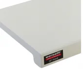
If the frames are white, a white sill gives a unified look and visually widens the opening. It suits Scandinavian style, minimalism and a child’s room. The drawback: coffee stains and marks show on white, but it is easy to clean (how to care for it).

Light and warm shades
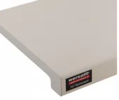
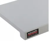
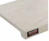
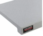
Cream, light oak, light grey: soft neutral colours. They work well in rooms with warm light and wooden furniture, do not need an exact match with the floor and are liked by almost everyone.
Wood
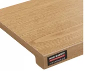
Wood-effect decors tie the sill to the doors, the floor and the furniture. A tip: do not chase an exact match. It is better to take a shade one tone lighter or darker than the floor than almost the same one: it then looks like a considered combination rather than a failed attempt. Watch the undertone: warm (yellow-red) and cool (grey-brown) shades do not go together on one surface.
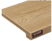
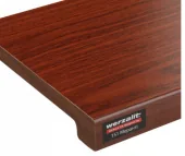
Fitter’s tipPut a wood sample right on the floor or next to the door. If the colours argue in daylight, they will always argue.
Dark and graphite
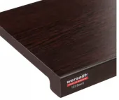
Wenge, dark grey and puntinella are expressive colours for light rooms with large windows. They look good with dark frames and doors. Keep in mind that dust and fingerprints are more visible on a dark surface and glare is stronger on the sunny side.


Stone, marble, concrete
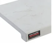
White marble, dolomite and quartz suit kitchens, bathrooms and loft or modern classic interiors. A stone-effect sill looks expensive and goes well with a worktop of a similar pattern (Wermodin worktops).
Light and the size of the room
- North side. The light is colder and dimmer: choose warmer and lighter shades so the room does not feel icy.
- South side. There is plenty of light, almost any colour will do, even a dark one; in bright sun light surfaces can glare.
- A small room. Light tones visually widen the space, dark ones shrink it.
- Evening lighting. The warm light of lamps changes the shade: look at a sample both by day and in the evening.
Which colour suits your style
| Interior style | What to take |
|---|---|
| Scandinavian, minimalism | White, light grey, light oak |
| Loft, industrial | Concrete, dark grey, metallic |
| Classic, neoclassic | White marble, meranti, oak |
| Modern, hi-tech | White, dark grey, stone |
| Eco, rustic | Rustic oak, light oak |
Guidelines: frame, floor and sill
| Frame and doors | Floor | What to take |
|---|---|---|
| White | Light laminate or tile | White or light oak |
| White | Dark | White (contrast) or wenge (matching the floor) |
| Wood effect | Wood | The same undertone, one tone lighter or darker than the floor |
| Grey, graphite | Any | Dark grey, metallic, concrete |
How not to go wrong: step by step
- Identify the main element. The floor, a door or a large piece of furniture: match the sill to it.
- Choose 2–3 candidates on the site and look at them enlarged.
- Compare in your own light by day and in the evening: the colour on a screen may differ from the real one.
- Check the decor code and write it down: “White (001)” and “Snow white (400)” are different decors.
- If in doubt, call us: a manager will help you compare options. All decors and prices are in the section “Werzalit windowsills”.
- In the estimate and the order always state the decor code, not only the name: this avoids confusion between similar shades.
- If a client orders a decor by a picture, record the choice in writing (a message or a signature on the approval).
Frequently asked questions
Which windowsill colour is the most universal?
White and light neutral shades: they suit most frames, floors and styles and rarely get boring.
Must the sill match the floor?
Not necessarily. Often it is better to choose a shade one tone lighter or darker than the floor than an almost exact but imperfect match.
Is dust visible on a dark windowsill?
Yes, dust and fingerprints are more visible on dark surfaces, especially on the sunny side. A Werzalit surface wipes clean with a damp cloth.
How do “White” and “Snow white” differ?
They are two different decors with different codes (001 and 400). It is better to look at both enlarged and compare in your own light.
Read also
 ChoosingHow to measure a window and choose a windowsill: a step-by-step guideWhat to measure and how, which width to take, how the series differ, and a cost example with real prices.Read →
 InstallationInstalling a windowsill: step-by-step guide and 7 common mistakesFrom preparing the base to sealant: the order of work and the mistakes that cost money.Read →
 TermsWhat the nose of a windowsill is and why you need itA small detail that decides whether the wall under the window stays dry.Read →